RaceTrac Self Checkout
Overview
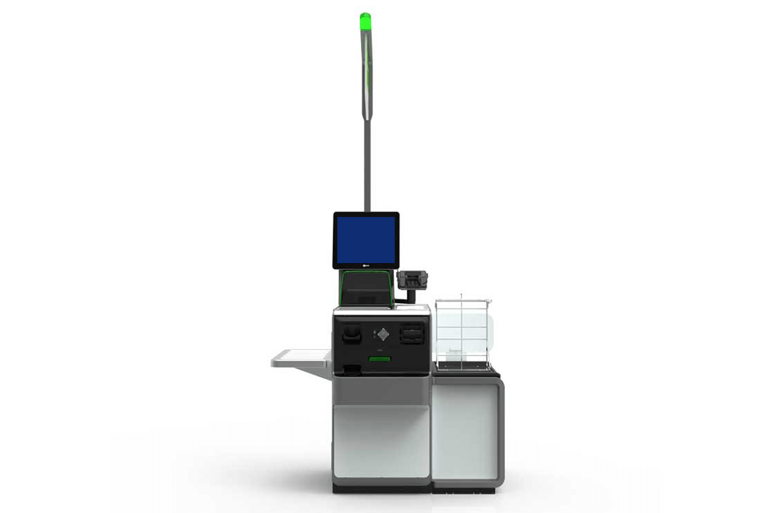
An estimated 80+ RaceTrac stores have self checkout lanes located near their cash registers. Since launching self checkout in these stores, the adoption has been low, so I was added to the project to evaluate why and how to increase the adoption rate.
Role
Project Designer
The Goal
The goal of this project was to implement short and long term solutions to enhance the UX of the self checkout machines in an attempt to make it easier to use and more welcoming to the guests.
Pain Points
The guest's paint points when using self checkout:
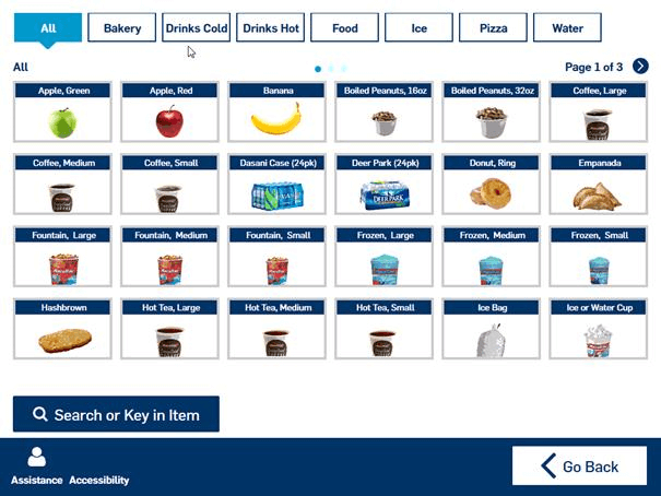
- Guest UX did not allow ease of finding products without a barcode (ice cream machine, roller grill items, etc.).
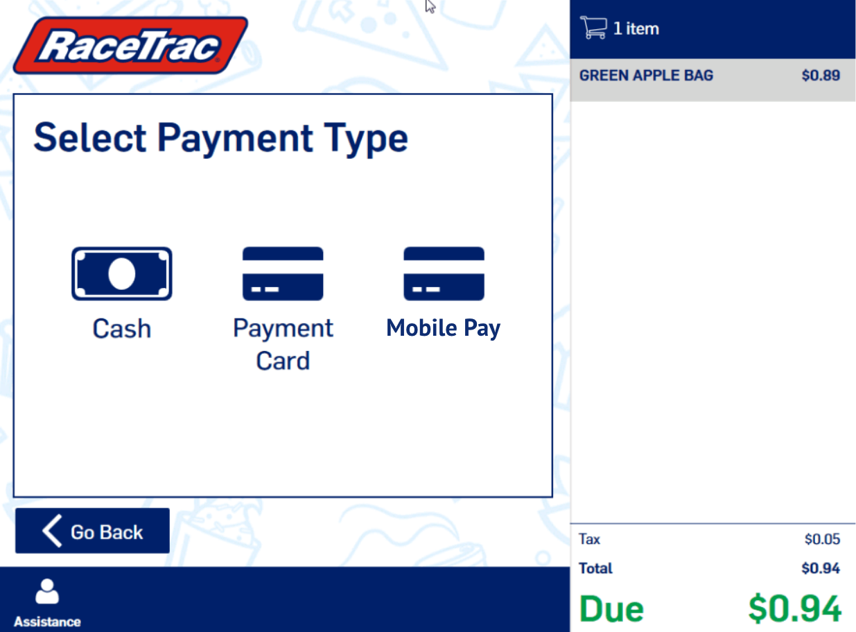
- It was not intuitive for guests to know they could use mobile pay.
- Guests would attempt to pay by inserting their card in the pinpad without pressing the "pay" button on the self checkout screen first.
- This would cause guests to stand and stare at the self checkout for a moment or call over a team member for help.
- The "attract" screen (the screen guests walk up to in order to begin their transaction) of self checkout was not welcoming to customers.
The Process
The pain points were discovered based on what store employees had witnessed, as well as user observation sessions where I watched customers interact with self checkout. Unfortunately, the machines do not have heat mapping or additional analytics that could be reviewed to help determine more friction points. We are working with our self checkout vendor to map out what options we could have in the future to provide these details, but until then, we will evaluate the short term and long term resolutions based on store employee feedback and observation sessions.
Short Term Solution
Features
The short term solution allowed quick fixes to be applied within a couple weeks since our internal team could make the updates. This allowed a faster turnaround of small tweaks to help relieve some of the above pain points.
These updates included:
- Update the "attract" screen's background image to be consistent with other store branding and more welcoming for the guest.
- Update the "attract" screen's verbiage to be more concise, knowing that guests are usually in a hurry and not prepared to read long statements or instructions.
-
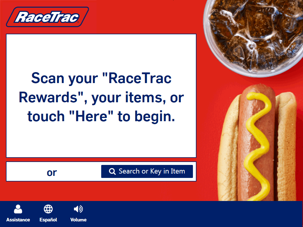
Before -
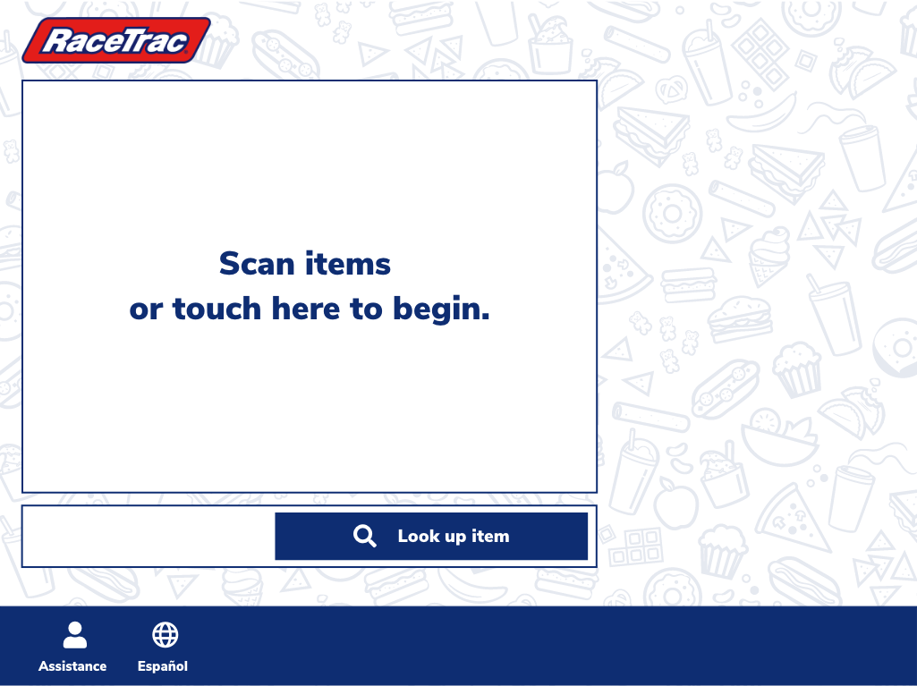
After
-
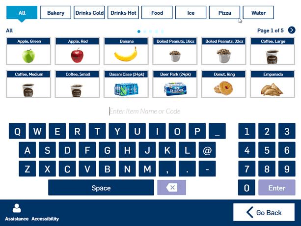
- Replace the "Popular" tab in the product search page with an "All" tab. Since our guests already have in their possession what they're purchasing, the "Popular" tab would require the user to know their item is popular at RaceTrac and browse within that tab. Replacing "Popular" with "All" allows users who prefer to browse items or cannot find an item that they currently have, to explore all inventory in one place.
- Add search back to the category/search page so users have every option of searching, browsing, etc for finding the product they're trying to purchase.
- Replace the "Coupon" tender option with "Mobile Pay" to call out to the guest that this is an option. Transaction logs show that users do not select the "coupon" tender when they get to this stage. Therefore, this replacement doesn't take away the coupon functionality. We were unable to replace the image without vendor intervention, so that enhancement will occur at a later date.
Short Term Results
These updates were complete in 2019. After the changes were implemented, the store employees have agreed that the updates have improved the user experience, making it easier for guests to find what they're looking for.
Long Term Solution
Design a redesign that resembles our pump screens resulting in a unified guest experience. As well as other enhancements that could not be completed by internal teams.
These updates included:
- New "attract" screen
- New "age gated" items flow
- Updated imagery
- Updated quick pick buttons that are more in line with what the guest would expect
- Allow the guest to insert or tap to pay at any point in the transaction to complete their transaction
- Updated instructional audio clips
- Enhanced loyalty/rewards program experience
- Updated coupon usage experience
